The best data recovery company deserves the best website
Hand-rolling the finest web experience for our favourite hard drive heroes. (January 2024)
We love East Anglian Data Recovery. We recommend EADR to every client of ours that needs data recovery; there's nothing they will not work on and their success rate is outstanding. We use EADR to fix our own drives when they take an early retirement, too. And we don't just say that because we're biased by liking Steve and Allison (we are because we do). They win awards for this, as voted on by tech professionals across the country; EADR is the data recovery company trusted by techies.
So when we were offered the opportunity to build a new website for them, we jumped at it! And then we stopped jumping because that tired us out and wasn't helping their website, and then we built it.
The old site
The old site was built on WordPress. It had a custom theme, with a bunch of plugins to turn WordPress into something other than blogging software. There was much to like about it! Structurally the site was sound; we left the page structure almost entirely unchanged. Most of the content on the new site is the same content with a little polish. And there were visual elements that could have worked well, if they were implemented consistently. But it also exhibited the usual "WordPress-plus-a-pile-of-plugins" problems.
It wasn't fast
On a desktop machine with a fast Internet connection, the old site was fine, though the page layout reflows were grating. On a phone with slow mobile data, it was glacial. Adding a caching layer in front of WordPress at least solved the time-to-first byte problem, though in our experience these caching layers end up creating their own sets of problems, such as randomly breaking the site. It was much harder to solve the vast amounts of JS and render-blocking CSS loaded on every page whether that JS and CSS was needed or not.
It was inconsistent
The downside to the Wordpress-plus-pile-of-plugins is that every plugin will have opinions about how certain things should look. Normally, a custom theme will then override these plugin's opinions with custom CSS to change their appearance. That works well until the plugin updates and changes a class name, causing your old CSS to not work anymore. Or, the theme just didn't account for every possible use of the plugin, which meant that there were some parts using the plugin's default styling.
For example, there were:
- At least four different rectangular button styles on a single page. Those were subtle differences; small differences in font, shape, and spacing.
- Three different ways of implementing a section "text on one side, image on the another".
- Three ways of styling a customer testimonial.
- Two ways of styling a card for a news article. One had spacing inside and a border, some blended in to their background. One had a blue title, one had an orange title. One had the date on it, one did not.
We could go on with the trivial inconsistencies. Trivial they were! Yet, what it gave was a subtly unprofessional feel; the unquestionably-best data recovery company in the country deserves better than that!
It randomly broke from time to time
This is a problem with any WordPress site with several plugins of varying quality; every update of the WordPress core or any of its plugins risked bricking the site. That came with costs. The most obvious is the development time spent to fix the breakage. The lost business that came from the site randomly not working is impossible to quantify. Every bit of downtime matters!
Fixing the speed
With one exception, there is not a single line of CSS or JavaScript code that was not written specifically for EADR's site. We don't believe in pulling in large amounts of third-party code that we may or may not need. We've always found that it's less effort in the long run to just write everything yourself.
For example, when a WordPress page builder needs icons, it usually pulls in the entirety of an icon font such as Font Awesome, because it cannot know what icons you are going to want in your site, and because of how WordPress is structured it is hard to dynamically build a subset of the things from the icon font that you are going to need on a given page. And then you add another plugin which also needs an icon font and cannot (or does not care to) determine whether some other plugin has also loaded the same icon font, so it'll pull in the entirety of Font Awesome again.
In fact, the site pulled in Font Awesome three times. Two of those were for Font Awesome in two different weights and the other was loading every Font Awesome brand icon so that it could get the Facebook, LinkedIn and Instagram links in the footer. This came to hundreds of kilobytes just for the icons.
We didn't need to do this! We knew what icons were going to be needed, because we wrote all the code. So we grabbed the SVGs we needed from Remix Icon, optimised them with SVGO, and consolidated them into a single SVG sprite that weighs 4.9 kilobytes compressed and does not block rendering.
On the backend, we used Django, which is already fast - because, again, it requires you to write all the code for your application yourself. We added regression tests to ensure guards against known performance pitfalls.
And then came the micro-optimisations. We inlined all the stylesheets into the HTML, because that saves one HTTP request; this necessitated building a mechanism to ensure that we only inlined some subset necessary to render the current page. We then GZip compressed the HTML from the server because inlining the stylesheets was making the HTML uncomfortably large - and that required writing our own middleware to avoid this becoming an exploit vector breaking HTTPS. Naturally, all static files are GZip compressed as well.
We are not great believers in caching to solve performance problems; that is a subject of another article that we'll never get around to writing, but the short version is "you're going to be serving from a cold cache some day, and that is going to hurt, so fix the underlying problem". But that doesn't mean we should not use caching; we've got plenty of free memory and we might as well do something with it.
So we added caching such that most of the individual sections on those pages built of them - such as the homepage - would be rendered from memory much of the time. And if the database did have to be hit, there was a caching layer for queries there. And if those both those caches were cold, we still had a time-to-first-byte of less than 100 milliseconds on most pages (plus network latency). We call it "opportunistic caching". If it can serve from memory, great! If it can't, the site is still fast.
And finally, we added a self-hosted copy of instant.page to make clicking around the site blazingly fast (the "one exception" mentioned above). It pre-fetches links on hover, so by the time you have clicked on it the page has loaded in the background. This is actually a reliable way to destroy a slow WordPress site; if your backend is slow then this kind of eager fetching of pages that may or may not be needed can make a server fall over! But we don't need to worry about that.
This, of course, all takes time; "hand-craft an SVG sprite sheet" takes more time than "stick some Font Awesome code in the header", and "write your own caching" takes a hundred times as long as "install some plugin that promises performance magic". And if there's a point to this article, it is that that if you want the fastest possible website you will need to spend some time up-front to write as much of it as you can yourself. There's no shortcuts there; code written to cover as many use cases as possible will be larger than something that does exactly what is needed crafted for your needs.
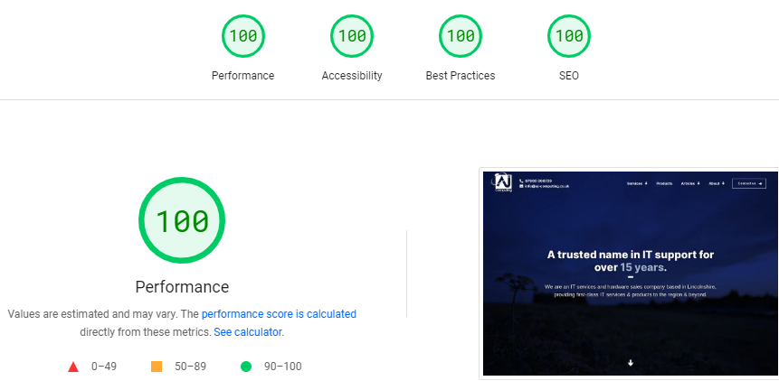
All of the above would be a pile of meaningless opinions about nothing if the end result wasn't actually fast. Was it?

Yeah, we'd say so.
Fixing the inconsistencies
There wasn't really much to this. Most of the inconsistencies were fixed by being lazy. You read that right (or maybe you didn't, and now you will go back and read it again)! When you are writing every piece of code yourself, you don't want to do more of it than is strictly necessary. You are not going to write a subtly-different button style for one section on a page on a site, because you already wrote one, and why would you want to do that again? You'll naturally want to re-use something that already exists instead. Or, why would you not just use this style of text-next-to-an-image for something structurally identical? And so on.
Yet, while implementing the site we found a nice consistency to add. That typing effect on the hero on the front page existed on the old site; we re-implemented it from scratch, of course, and by the way that is much harder to get perfect than it would seem at first glance. Even the idea of a blinking cursor came from the old site, though we changed the appearance of the cursor. And then we realised we could roll with that blinking cursor effect as the motif across the whole site. We think it looks pretty slick!
Fixing the problem of stuff randomly breaking
Django, on which we built the site, is very stable. They generally don't introduce major breaking changes between releases, and those breaking changes are always throughly documented. It also does not have a history of security holes big enough to drive a truck through; when a security update comes out, we can decide whether to apply it or not by just looking at our code, because we wrote all the backend code and know whether security problems apply to us or not. Yet, we like knowing that the site is not going to break. So we wrote automated tests covering over 90% of the code written for the site, which run on every code change.
Finally, we do not have an error-prone process for making code changes. Pushing code changes to the site is automated; no more FTPing files around! And naturally, everything is kept in version control so we can easily roll back to an earlier version if we accidentally break something - which the testing should make very unlikely.
But if something does break, we also have error reporting built in. A 500 error under some weird circumstance won't be something we discover months later when the thousandth person to discover a bug reports it (users almost never do this); it'll land in our inbox immediately and we can fix it before anyone else is affected.
And there are some nice new features!
A good chunk of EADR's business comes from other tech companies who are not experts in data recovery themselves, who know that attempting it themselves would result in an extra set of problems to solve, and who know that EADR are the best in the business. Like us! Previously, there was no reliable way to determine whether a referral came from one of these outside companies. So, in the simplest way that works, we added a feature that would allow partners such as us to get their own referral link and allow tracking of this attribution all the way through to the contact forms. Here's our link!
Yet, we respect the users' privacy; some people might not be comfortable having attribution tracked like this, and all forms have a very clear opt-out for this information being recorded, with the same prominence as any other field on the form. We think we found the perfect balance between business needs and user control.
Talking of opting out...you know those annoying cookie consent banners that appear on basically every website? Here's a hint: run uBlock Origin and you'll find that almost all of them do nothing! We had to implement one of those, but it is not just about cookie consent (and cookies are only a very incidental part of the GDPR). The Facebook Chat widget and Google Analytics will only load if the user opts in; these can reveal your visits to Facebook and Google respectively. Most importantly, the option to opt in and out of all of them are given equal precedence, and even opting in to some of them is easy as visiting this page linked prominently from the banner. Again, we think we found the right balance between what is useful for EADR and what is in the best interests of the user, by allowing the user to choose for themselves in a meaningful way.
That above feature took actual days of work to implement, by the way, for what most web designers consider a very incidental "pretend we comply with the GDPR" feature. Did we mention that doing things right takes time?
What do you think?
A huge thank you to AJ Computing who have worked incredibly hard on this project. Every single thing we asked for has been done, and so many extras we would not have thought of added in, to make the site and user experience the best it can be.
-- EADR
We went to a lot of effort to make East Anglian Data Recovery's site one befitting the best data recovery firm in the country - a site with the professionalism, speed, reliability and consistency of EADR themselves.
If you'd like to work with us on a project, get in touch.


