A new look for AJ Computing
After nine years, a redesign at last! (January 2021)
If you're reading this, you're seeing the new-look AJ Computing site! If you're not reading this, you've caused a paradox. Yep, we finally found time to redesign and rebuild our website from scratch.
A little bit of history
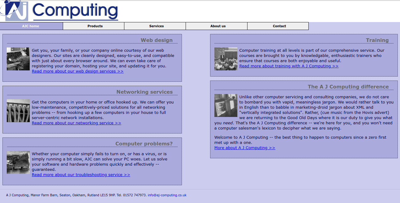
AJ Computing: A New Hope (2005)
AJ Computing started in 2005. Sixteen years ago! It's nearly old enough to drive. Of course, being a business that did things with computers (it was not a given that every business would be on the Web back then!), it gained a website a short while later.

That website was entirely a thing of its time (well, maybe two years before its time). We regret nothing; it did what it had to do for many years.
In 2012, with our 2005 site looking a little dated, we gave it a complete refresh.
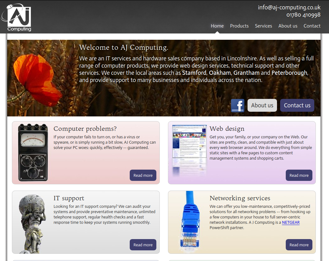
AJ Computing: Reloaded (2012)

Which...well, was still a thing of slightly before its time too, as witnessed by the cliches like rounded buttons, gratuitous use of gradients, and the fact that it was fairly terrible on mobile. OK, we knew about smartphone browsers at the time, and not all sites of the era were terrible on mobile, so we don't entirely have an excuse for that. Still, we did not see the massive increase in mobile browsing that would follow, and we got rather too busy to build a new website, so it stayed that way, for quite a while.
Which is to say, nine years later...
AJ Computing: Return of the King (2021)
You're looking at it now. Nice, isn't it?
Designing our new look
We chose the dominant typeface for the site (as used in headlines), and worked backwards from that. We chose Inter, in 700 and 800 weights. We love it! The tall x-height is gorgeous.
Everything followed naturally from the trusted, authoritative look of Inter. Inter, in those strong weights, rewards strong headings, solid blocks of colour, and strong imagery. Even the little right-arrows you see all over the place followed naturally from the font.
The site is also now fully responsive. It works great on mobile (and if it doesn't, that's a bug and you should tell us!), but also looks glorious on massive monitors, and everything else in between. Mobile-friendly does not mean desktop-unfriendly!
Because we know how quickly things date, we've deliberately steered away from any kind of contemporary design trends. We want something that is going to look as good in 10 years as it does now. And not just because that's probably how long it's going to take for us to get around to redesigning our site!
Need for Speed: High Stakes
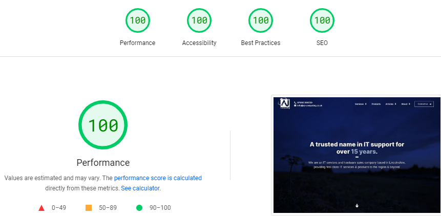
Both of our previous sites were static HTML, which meant they were blazingly fast (if you use the metric of time to first byte). Our new site runs Django on the backend. Django is wonderful, and can be very performant, but there was a risk that we could performance to drop compared to our old site. That would have caused a big drop in search engine rankings!
So, we pulled out all of the stops to make this new site fast. It meant a couple of very late nights.
First, we ensured that the site was making as few database queries as possible. Then, we added a query cache layer so that identical queries would be fetched from memory rather than the database. And then we added code to ensure that most of the rendered HTML would be fetched from memory most of the time, too.
We also inlined the entire stylesheet of the site in the head of the document to remove one blocking HTTP request from the render path. The entire stylesheet is about 49 kilobytes, minified, which is large enough to be a non-trivial overhead. So we now gzip compress the HTML. That reduces overhead to a mere 7 kilobytes, which is entirely acceptable.
(Yes, techies, we know about the BREACH attack, and we're not vulnerable to it because we never reflect user input in HTTP response bodies.)
So what do you think?
Of course we love our new website, because we made it. How about you? Do you love it or do you hate it? You should tell us what you think!


